DSA Request Dashboard
DSA Request Dashboard
The DSA Request dashboard shows an overview of the service requests received from the users based on different criteria. Here, you can find the number of active requests, requests by type, region, and a lot more information. The filter icon found in the bottom right of the screen can be used to alter the displayed results based on different tenants, requestor types, and more.
For navigating to the DSA Request Dashboard,
- Log into the Data Governance tool.
Click on the hamburger icon
 on the top left corner.
Click on 'DSA request' from the menu.

Note: The requests data and the filters visible to a user in the DSA Request Dashboard are based on the tenant, acts, and requestors mapped to them in the user permissions mapping section.
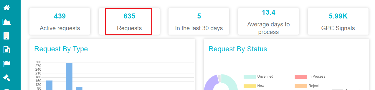
The DSA request dashboard appears on the screen, showing information sorted as Active Requests, GPC Signals, Average days to process requests and more. Clicking on any of the grids/ information represented on the screen redirects to a separate screen providing more information related to the selection that you've made.
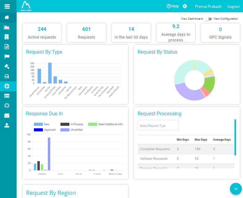
- Active Requests
This number on the DSA request dashboard reflects the number of active service requests.
Clicking on it will redirect to the following screen.
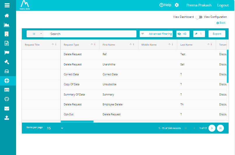
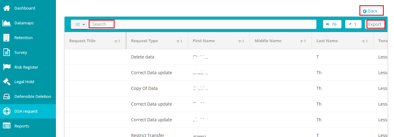
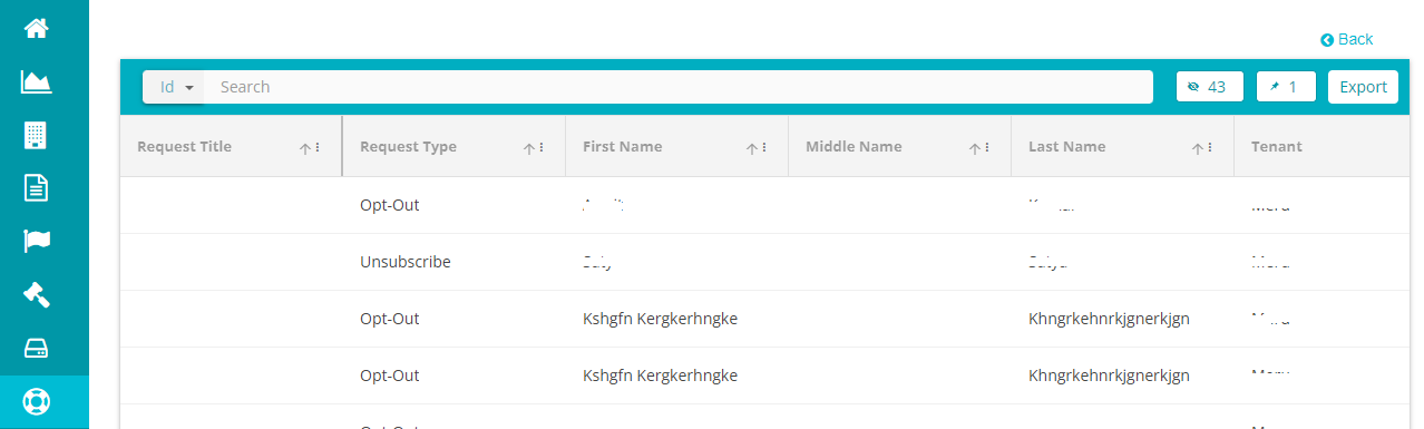
You can find all the active requests listed on the screen with their Titles, Request Types & Subtypes, Requestor's Names (first, middle, and last), Tenant Name, Domain Name, Region Name, Requestor Type & Subtype, Request Data, Status and more.
Use horizontal scrolling to verify all these details for every request.
Use the 'Export' option to export the information related to active requests.
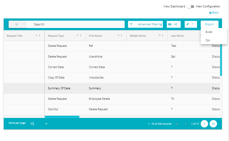
Clicking on Export provides two options -- Excel, and Csv. You can select either of these options based on your required format of the exported files.
Upon clicking either of these options, the document saves itself
If you want to search for a specific request, use the 'Search' bar.
<!-- -->
- Clicking on the 'eye' icon opens the visible columns section.
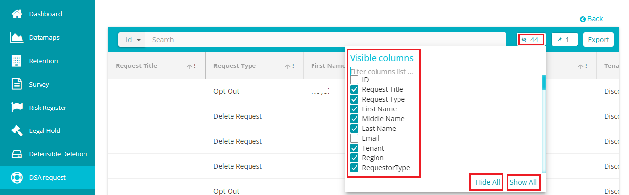
Check the columns/options from the Visible Columns menu that you want to be displayed on the screen. Use the Show All option if you want all the columns to be displayed on the grid. Likewise, use the Hide All option to hide every column in the grid.
- Click on the 'pin' icon to pin columns in the grid.
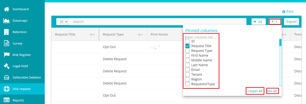
You can check the options/ columns from the Pinned Columns menu that you want to pin. Use the 'Pin All' option to select all the columns and the 'Unpin All\' option to clear the selections.
Click on \< Back if you want to return to the main dashboard screen.
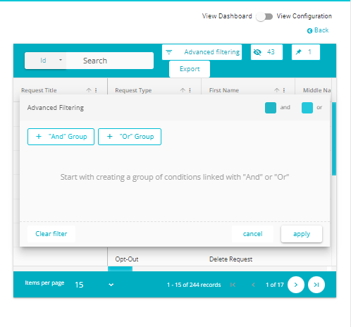
You can further filter the results using Advanced Filtering
- Requests
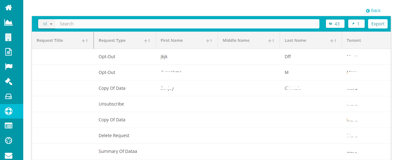
It reflects the total number of requests (both active and completed) received within a specified duration. Clicking on it will redirect to the Requests screen where you can find the information related to all requests made, including titles, request types & subtypes, requestor's names (first, middle, and last), tenant, region, requestor type & subtype, request status, and a lot more information related to every request.
Clicking on the 'Requests' will take you to the following screen, where you can find information related to all the requests received from different requestors.
Use horizontal scrolling to verify all these details for every request.
Use the 'Export' option to export the information related to active requests.
If you want to search for a specific request, use the 'Search' bar.
For pinning specific columns, use the pin icon.
Use the eye icon to view specific columns in the grid.
Click on \< Back if you want to return to the main dashboard screen.
- In the last 30 days
It reflects the total service requests received in the last 30 days with the last date being today. Clicking on it will redirect you to the screen showing all the information related to the service requests from the last 30 days.
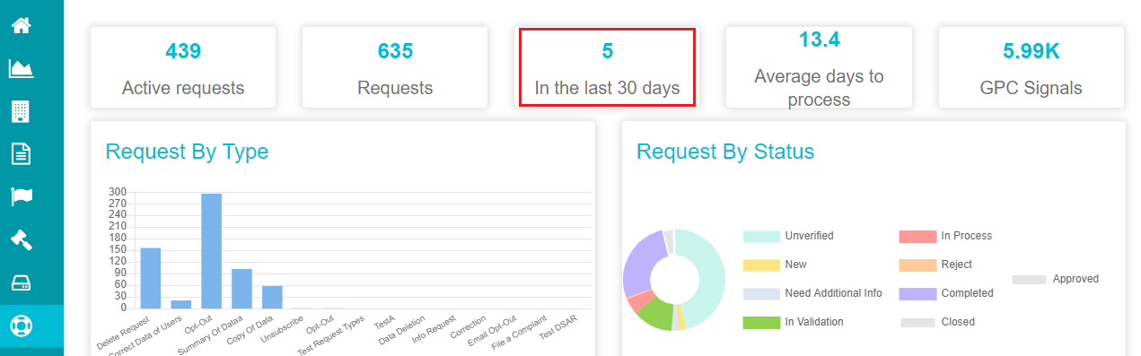
- Click on 'In the last 30 days' option on the screen.
This selection displays the following screen, showing the information related to all the requests received within the last 30 days.
Use horizontal scrolling to verify all these details for every request.
Use the 'Export' option to export the information related to active requests.
If you want to search for a specific request, use the 'Search' bar.
For pinning specific columns, use the pin icon.
Use the eye icon to view specific columns in the grid.
Click on \< Back if you want to return to the main dashboard screen.
- Average days to process
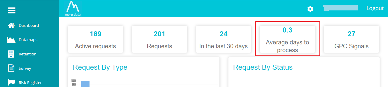
This information is the average duration taken to process a service request received from the user. The numbers here are shown in decimals if the duration is less than a day.
- GPC Signals
This information is related to the GPC signals detected from each request. Clicking on it will take you to the following screen. Here, you can find the total GPC signals in the first bar graph and the total GPC signals received in the last 30 and 7 days in the second bar graph.
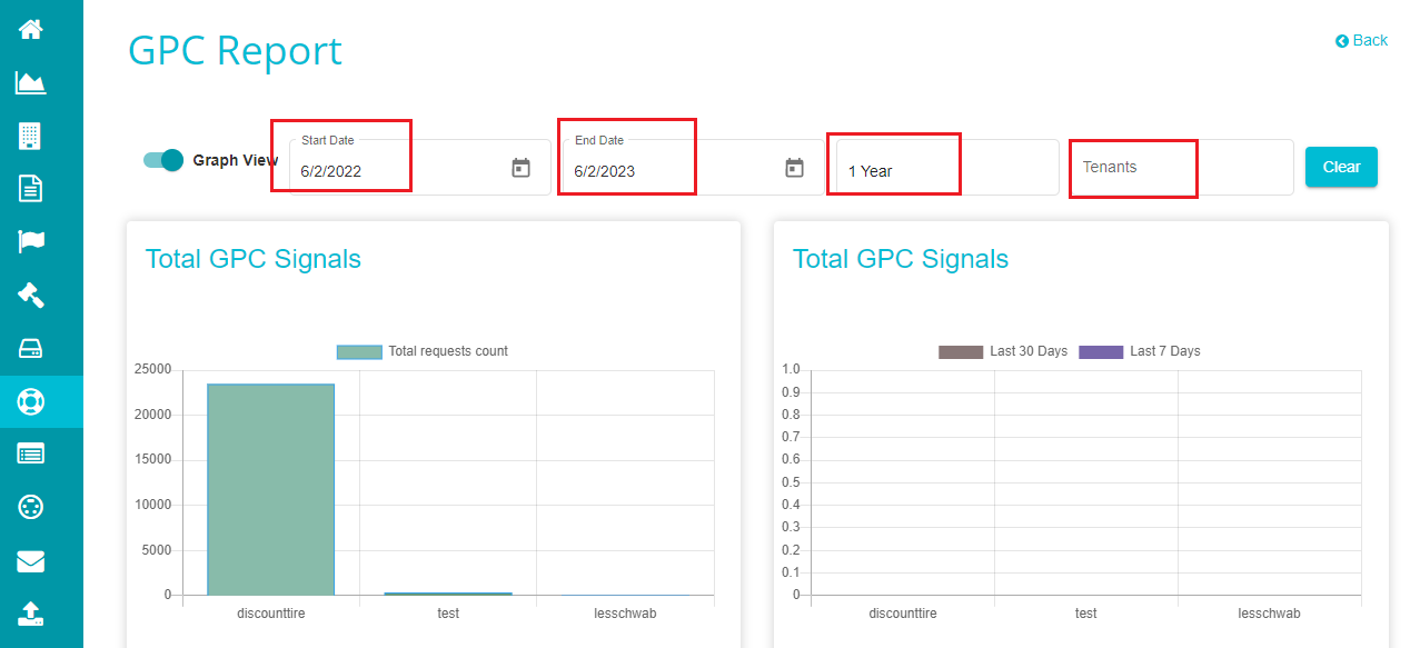
You can alter the start data and end date inputs or change the duration from 1 year and view the GPC signals' information accordingly.
Use the Tenants drop-down and select a specific tenant if you want to view the GPC Signal information for a specific tenant.
Click on Clear if you want to reset all the selections to default.
If you want to see this information in tabular form, you can disable the 'Graph View' option and can see the results in the following way.
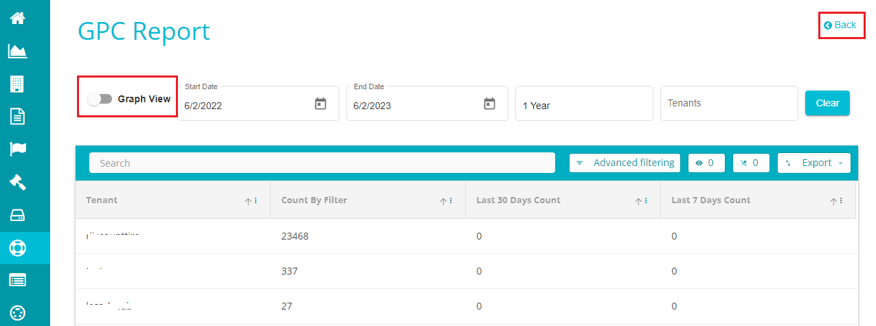
Use the 'Advanced Filtering' option if you want to filter the results in a specific way at requirement.
Click on \< Back to return to the main dashboard.
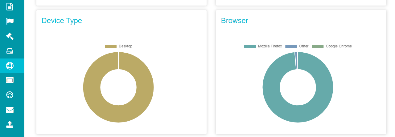
This screen also shows the following pie-charts showing information related to the devices from which the users placed their requests and the browsers they used for the same.
Note: Placing your cursor on any of these graphs when graph view is enabled will display the information represented in that area of the graph.
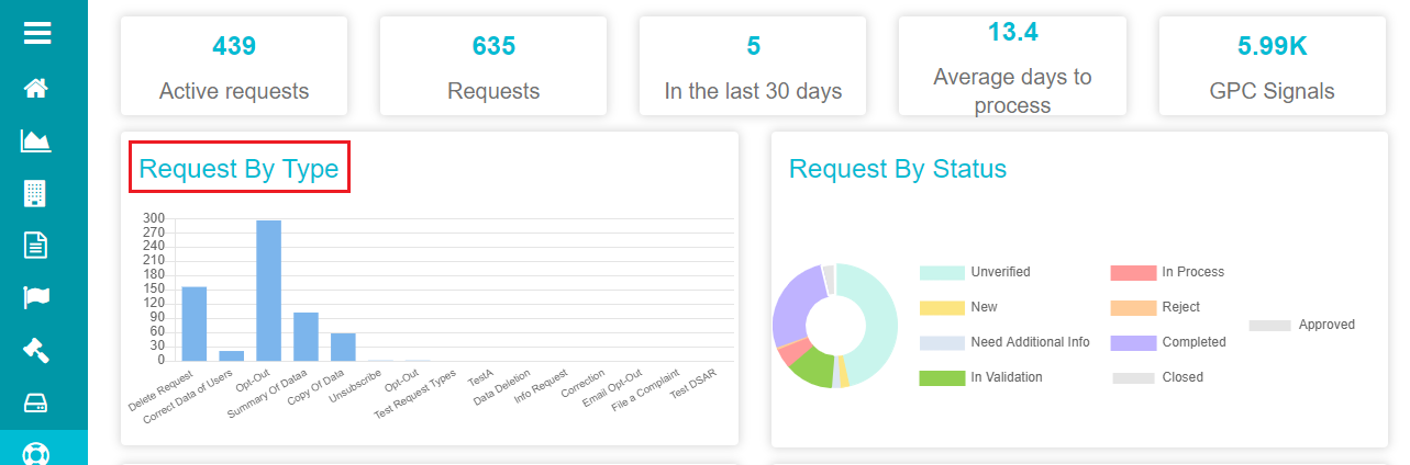
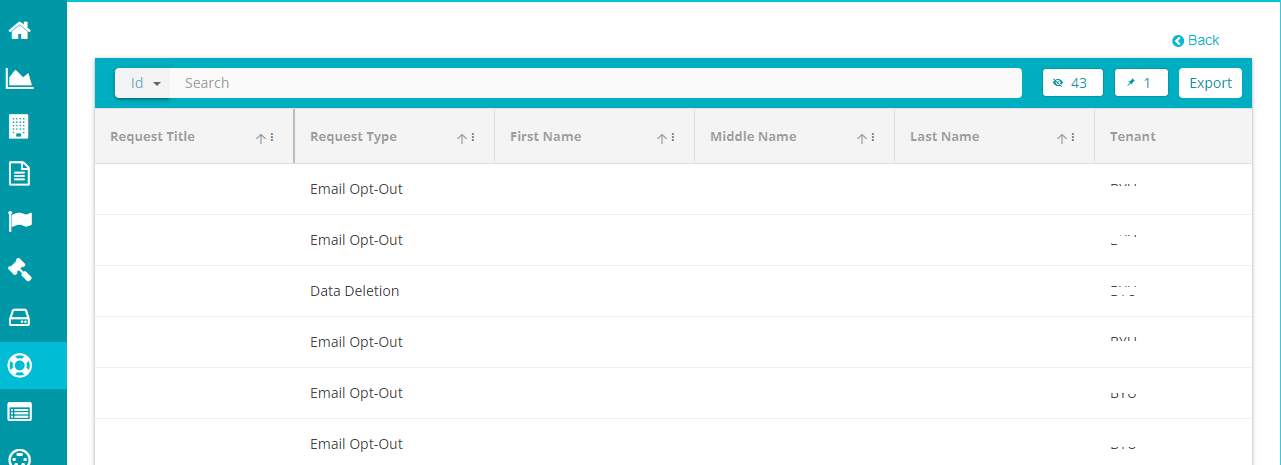
- Request By Type
This bar graph shows the number of requests received for every request type. Clicking on any of the bars redirects to a screen showing all the requests of the selected type.
Note: Placing the cursor on any of the bars shows information related to the bar -- the request type and the number of requests for it.
- If you want to see the information related to every request by type mentioned in the chart, click on any of the bars and you'll see the following screen.
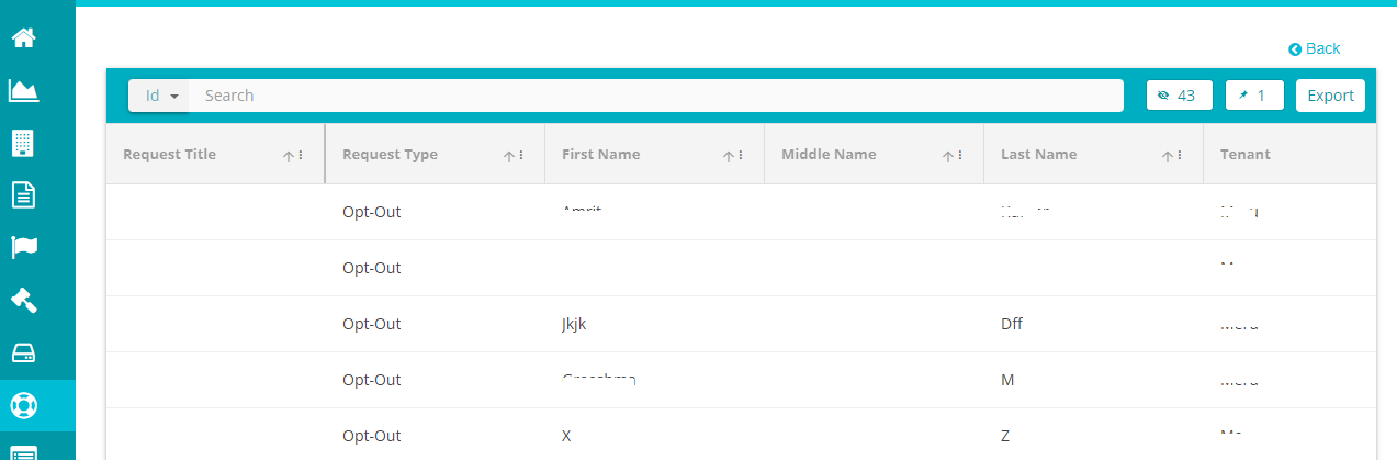
This screen shows the information related to opt-out request type from the request by type graph.
- Request By Status
This is a pie-chart representing all the service requests based on their processing stage.
Clicking on any of the sectors or the bars showing information on each sector navigates to a screen representing every request in the selected status.
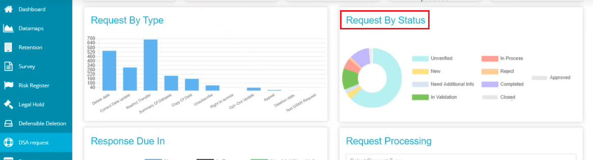
Note: Each color/sector represented on the pie-chart reflects a specific stage of processing the request.
- Click on any of the status types on the screen (mentioned next to the pie-chart), and you can see all the requests in that stage appearing on the screen in a table.
This screen shows all the new requests received from different requestors. Likewise, you can click on any stage and view the requests being processed in it.
- Response Due In
This bar chart represents the information related to the response due for every request. Placing your cursor on any of the bars shows the information represented -- if the response is overdue or on time, and the number of requests matching that response.
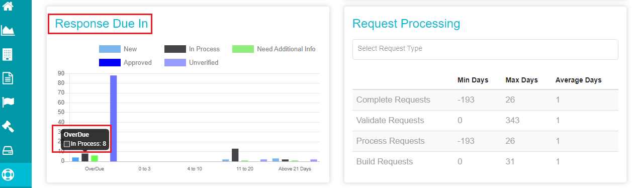
- Again, if you want to see the data represented by every bar in the chart, click on it and you can see the following screen showing all the information related to the requests covered in it.
This is the over-due bar represented in the graph, where you can find all the requests and information related to each of them.
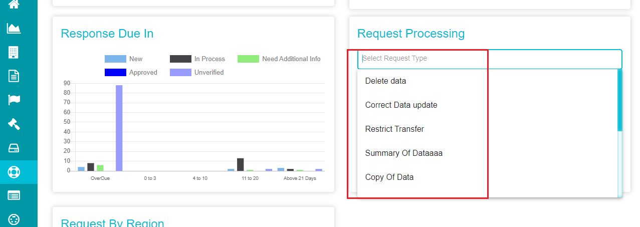
- Request Processing
Here, the requests in every stage are represented in tabular form with details like minimum, maximum, and the average number of days for processing requests in each stage.
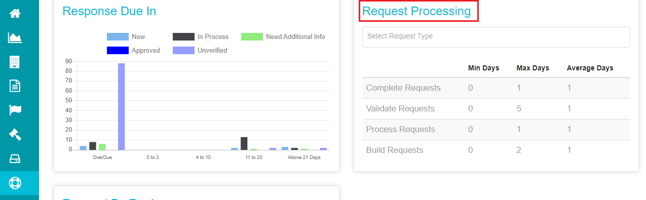
If you want to sort this information based on the request type, click on the 'Select Request Type' drop-down menu, and select the request for which you want to see the processing information.
- Request By Region
It is a pie-chart showing information related to the service requests received from different regions.
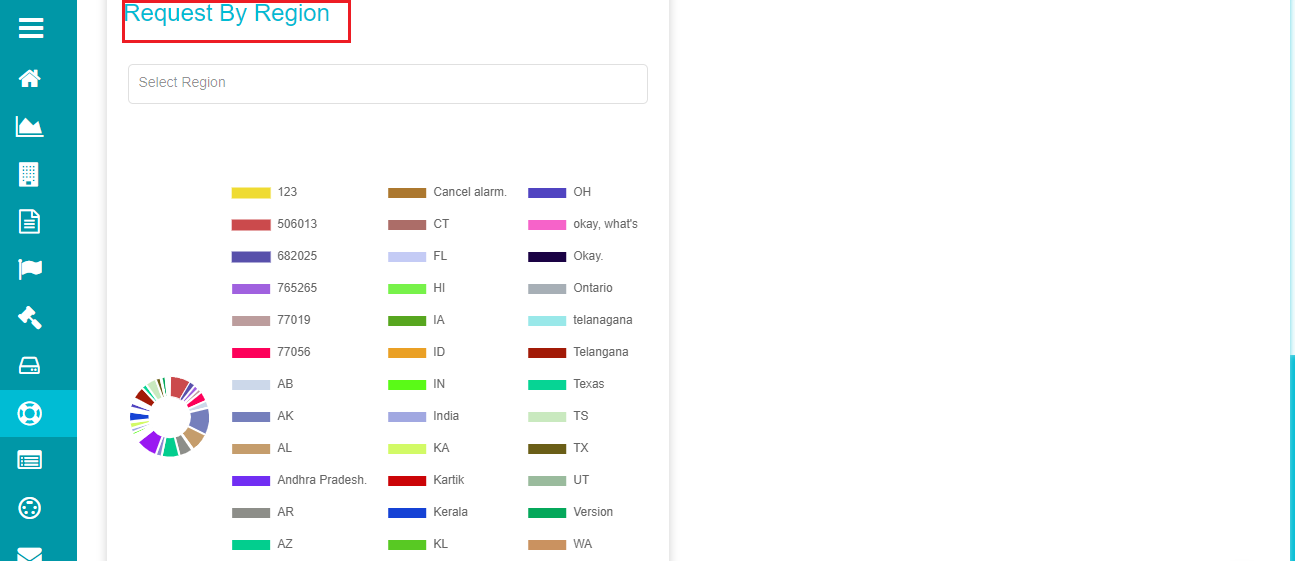
Each sector on the pie-chart represents a region from where the service requests are placed. Placing your cursor on any of these sectors shows the total number of requests received from the selected region.
If you want to see the data related to any of these sectors, click on the rectangular bars and you can see the following screen showing all the information reflecting it.
- Filter Charts
Clicking on the ![]() icon on the screen opens the Filter
Charts for the DSA Request dashboard. Here, you can filter the results
based on the tenants, requestor types, and privacy acts applied for each
request.
icon on the screen opens the Filter
Charts for the DSA Request dashboard. Here, you can filter the results
based on the tenants, requestor types, and privacy acts applied for each
request.
Apply the necessary filters by selecting the required options from each drop-down menu.
Click on 'Filter' after making the necessary selections.
Note: Use the 'Clear' option if you want to remove all the applied filters.
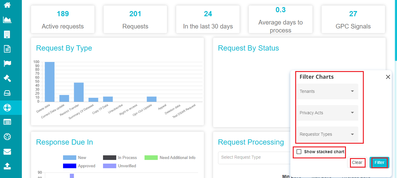
- Check the 'Show Stacked Chart' option if you want to see individual bar graphs for each tenant, act, or requestor, and select the required option.
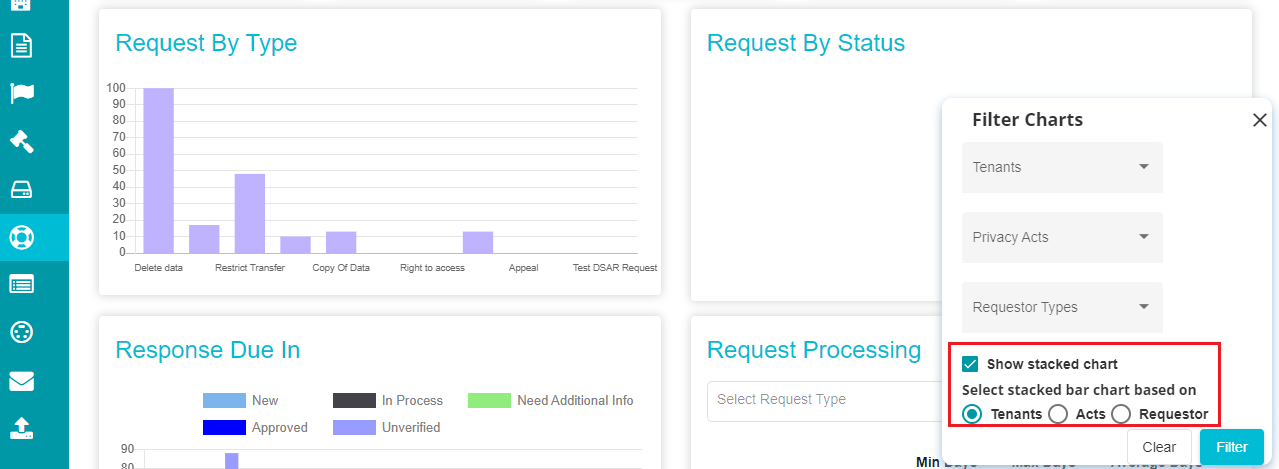 The changes made in the Filter Charts are reflected on the entire
dashboard, and you can see the results from each graph based on the
applied filters.
The changes made in the Filter Charts are reflected on the entire
dashboard, and you can see the results from each graph based on the
applied filters.